UI Design Challenge: Checkout Flow
 I was looking to brush up on my UI design skills and let sharpen.design create me a prompt. I took up the first prompt that was generated for me which was:
My Role
- Low & high fidelity wireframing
- Prototyping
- Icon creation
- Page layout design
- Asset creation and optimisation
- Creating visual direction and style guides
- Illustration
Design Tools
- Figma for all wireframing and prototyping as well as icons
- Illustrator for the poster
- Photoshop for all moodboards and additional assets (such as the fan shirt)
- Xd combined with Photoshop for gifs of the prototype
Research
To start with, I had a look at common best practices for checkouts from NN/g as well as Baymard. Since I haven't actually attended a film festival myself ever before, I also had a look at what happens during a film festival to get an idea what users would expect from a corresponding event website.
I formulated user needs statements to determine how many steps my flow needed and where I could reduce steps to keep the flow simple and streamlined to not overwhelm users or make them abandon their cart.
Design Considerations: Design Patterns and Best Practices
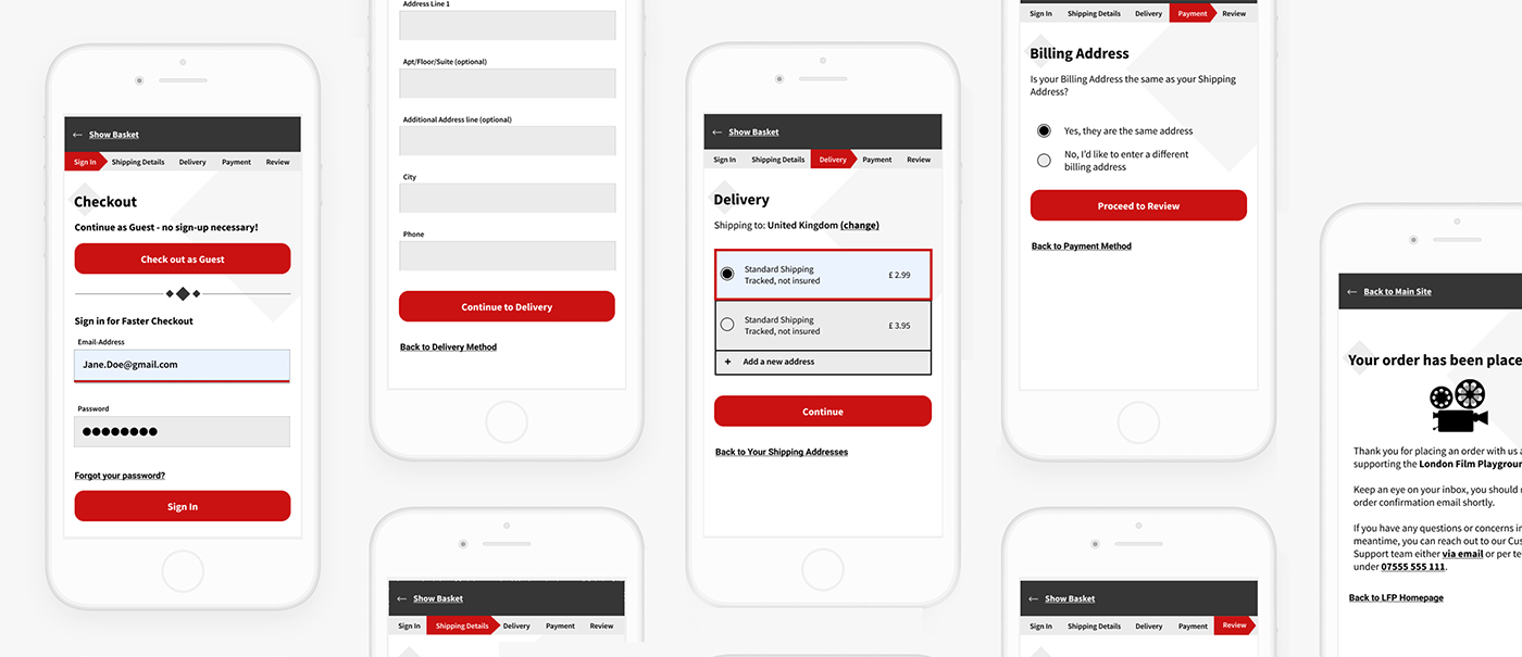
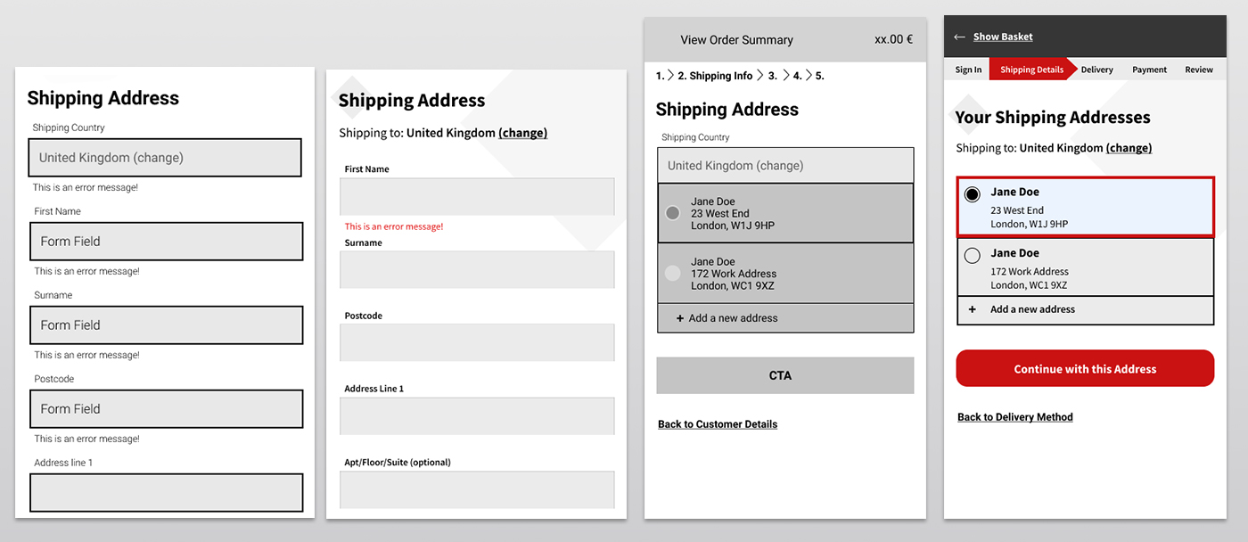
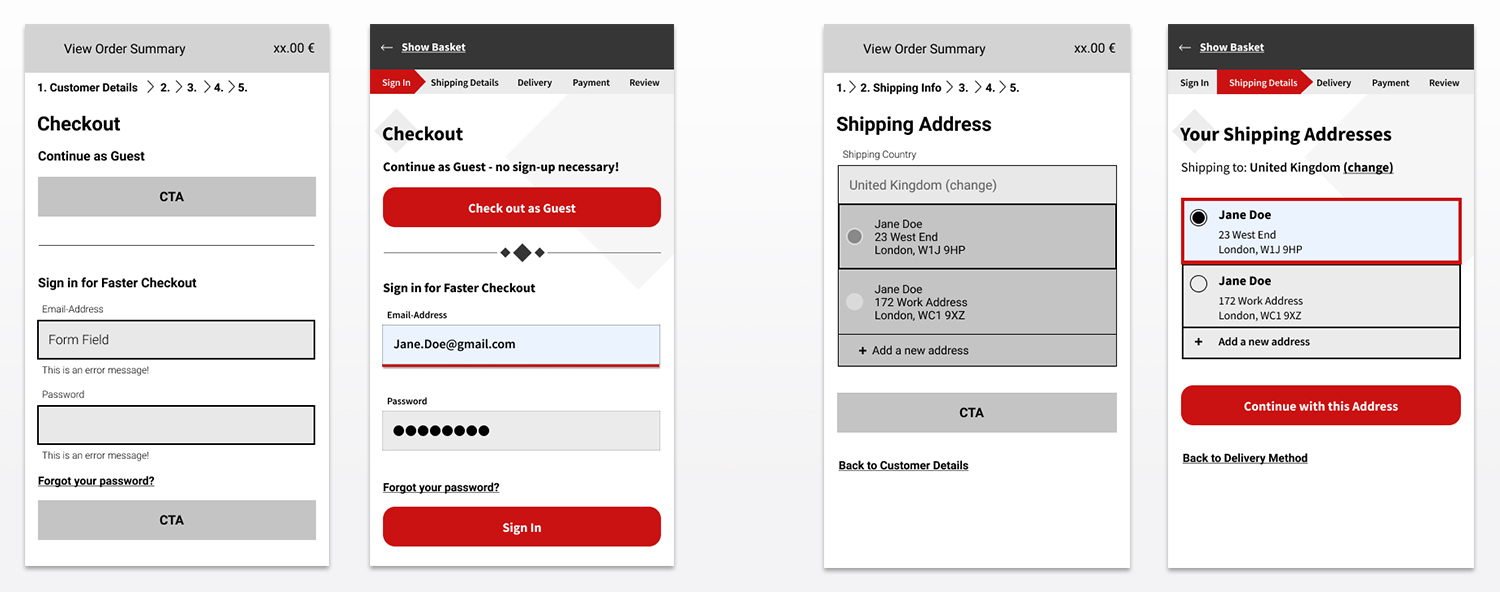
From the UI side, I made sure to keep form fields clean and easy to read. Material UI's minimalist web design popularized floating text fields but I followed NN/g recommendation instead and kept both the form label and hint text outside of the textbox to minimize potential accessibility issues as floating labels can be missed by screen readers.
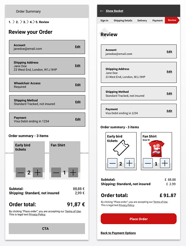
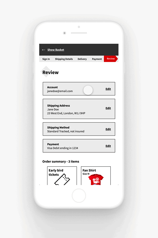
To show users the progression in the checkout flow, I decided on the breadcrumbs design pattern: It's a bar at the top showing the user each individual step of the checkout, consisting of 5 total steps (Log in/Register, Shipping, Delivery, Payment, Review).
One of the top reasons why people abandon their shopping carts are roadblocks such as a log-in wall. To avoid this usability issue, I included an option to check out as a guest, so users don't have to register unless they wish to.
After mocking up my screens in low fidelity, I took a step back to determine the visual direction this project would take.
Visual Direction and Illustration
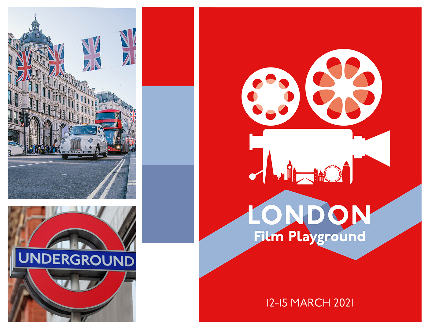
I made up a fictional film festival in London, so I designed a poster that would serve as inspiration for colors as well as style. I kept the poster minimalist, a callback to the iconic Keep Calm and Carry On posters. The color scheme was inspired by London itself, the doubledecker buses to be precise – though when I think of London or the UK in general, the main colors that come to mind are red, blue and white. I tweaked the selected color palette for the actual UI itself as the pictures that worked well for a large poster weren't quite accessible enough when combined. The red is a touch darker while the blue is a touch lighter, meeting WCAG standards.
With the visual direction set in stone, I set out to create my UI components. Before creating a library of components for this project, I skinned a single screen with many UI elements so I could get a feel for how colors would work together. After playing around with the two blues and the red, I decided to go with a color scheme that is primarily red as it matched the existing poster the best. The blues also made the page look too much like a social network whereas just using black seemed too monochromatic and boring.
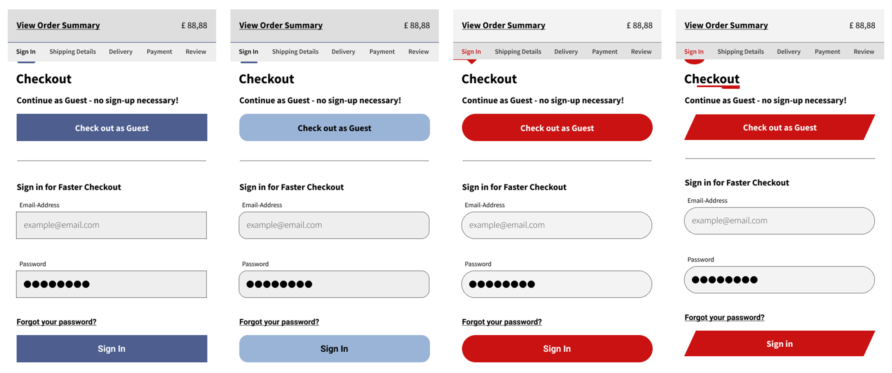
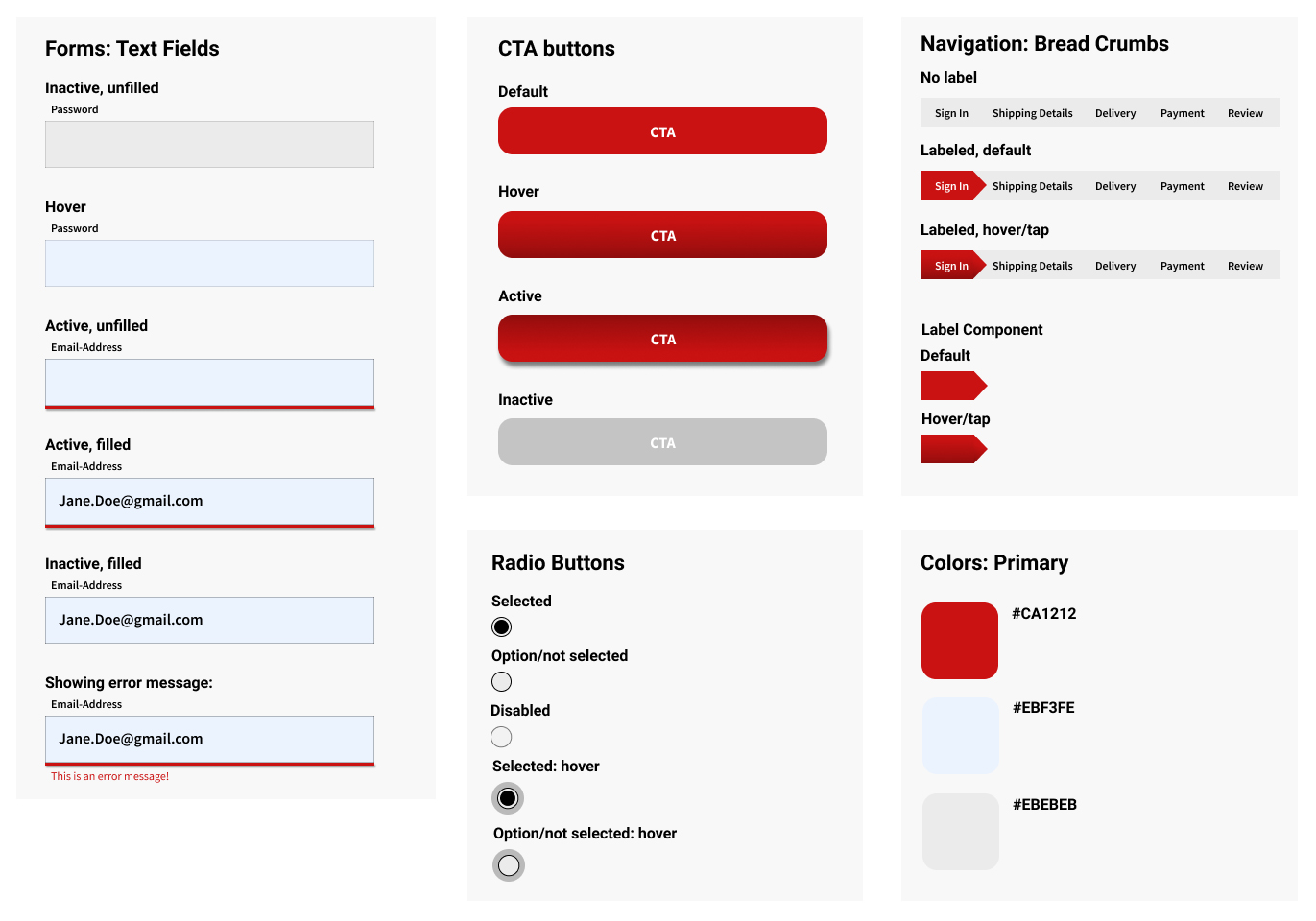
To keep true to the geometric part of the challenge, I added subtle geometric elements to my components and the background. I experimented with different shapes and textures but I found that a lot of those were very distracting on a checkout flow and would impact the user experience negatively since they were cutting into buttons or compromising the legibility of text boxes, so the flow ended up more minimalist with some geometric elements instead.
Learnings:
This challenge allowed me to sharpen my Illustrator skills and create an impactful poster. I learned how to create geometric patterns as well as improved my iconography skills. I also learned new tricks when it comes to prototyping in Figma as I've previously only prototyped in Xd and Sketch. Additionally, I reinforced my knowledge on good checkout flow guidelines.
← Back to Portfolio Overview